

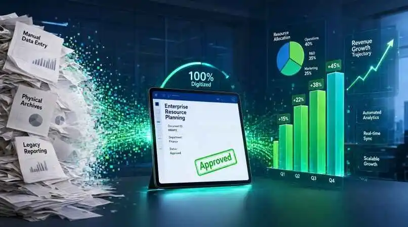
How the Right Business Forms Boost Profits and Efficiency
The Invisible Engine: How Smart Forms Actually Drive Business Growth
Imagine this: You’ve just spent three weeks perfecting a high-converting landing page. The copy is punchy, the design is sleek, and the traffic is pouring in. But then, the user hits the “Contact Us” button. They are met with a clunky, twenty-field form that asks for their fax number and their mother’s maiden name.
Within six seconds, they’re gone.
Most businesses treat forms as a digital necessity—a boring piece of plumbing that just “gets the data.” But after years of optimizing conversion rates and streamlining operations, I can tell you the truth: forms are actually the primary interface between your business and your customer. When they work, they are a frictionless bridge to revenue. When they don’t, they are a brick wall that kills your growth.
Whether you are a solo founder, a non-profit coordinator, or a corporate operations manager, the way you collect information determines how efficiently you can scale. Let’s stop looking at forms as administrative chores and start treating them as strategic assets.
The Psychology of the Input Field
Before we talk about software or SEO, we have to talk about the human brain. Every field you add to a form is a “cognitive tax” you are charging your user. The more fields there are, the higher the tax, and the more likely the user is to abandon the transaction.
The Friction vs. Quality Trade-off
There is a constant tug-of-war in business: you want the most data possible to qualify a lead, but you want the least amount of friction to maximize the number of leads.
- Low Friction: A simple email opt-in. High volume, lower quality. You get 1,000 leads, but 400 of them are bots or people who forgot why they signed up.
- High Friction: A detailed application form with 15 questions. Low volume, high quality. You get 20 leads, but every single one of them is a perfect fit and ready to buy.
The secret isn’t choosing one or the other; it’s using progressive profiling. This means asking for the basics first (name, email) and then asking for deeper details (company size, budget, pain points) only after the user has already invested time in your ecosystem.
Design Cues That Increase Completion Rates
If you want people to actually finish your forms, you need to design for the lizard brain.
| Element | The Old Way (Friction) | The Pro Way (Flow) | Why it Works |
| Layout | Multi-column grids | Single-column vertical | Reduces eye strain and cognitive load. |
| Labels | Placeholder text only | Persistent labels above fields | Users don’t have to remember what the field was once they start typing. |
| Validation | Error message after clicking “Submit” | Inline, real-time validation | Corrects mistakes instantly, preventing the “Submit-Fail-Retry” frustration. |
| Length | One giant wall of fields | Multi-step “wizard” format | Breaks a daunting task into bite-sized, achievable wins. |
Real-Life Applications Across Different Organizations
Forms aren’t just for “Contact Us” pages. They are the backbone of almost every internal and external organizational process. Let’s look at how different entities use them to solve actual business problems.
- Small Businesses and Freelancers (Lead Gen & Onboarding)
For a freelancer, a form is the first “filter” for a client. Instead of an open-ended email that leads to a three-hour discovery call with a client who has a $50 budget, a structured onboarding form does the heavy lifting.
- The Application Form: Asking “What is your budget range?” and “What is your desired deadline?” upfront allows the freelancer to prioritize high-value leads.
- The Intake Form: Once a client signs, a detailed intake form (asking for brand guidelines, logins, and goals) ensures the project starts without a dozen “quick question” emails.
- Mid-Sized Corporations (Operational Efficiency)
In larger organizations, the “invisible” forms—internal ones—are where the most time is wasted. Think about the “Request for IT Support” or “Expense Reimbursement” process.
- Standardized Request Forms: By replacing “Hey, my laptop is broken” emails with a form that requires the device ID, the specific error code, and the urgency level, the IT department cuts resolution time by 30-50%.
- Employee Feedback Loops: Quarterly pulse surveys that use Likert scales (1-5) allow HR to quantify sentiment and spot burnout before it leads to turnover.
- Non-Profits and Community Organizations (Volunteer & Donor Management)
Non-profits live and die by their ability to organize people. A form here is more than data collection; it’s a tool for engagement.
- Volunteer Matching: Instead of just asking for a name, a smart form asks for “Skills (e.g., accounting, gardening, social media)” and “Availability.” This allows the organization to slot people into roles where they will actually be successful.
- Donor Pledges: Recurring donation forms with pre-set amounts (e.g., $25, $50, $100) use “anchoring” to encourage higher gift averages than a blank box would.
Building the Perfect Form: A Step-by-Step Strategy
If you’re staring at a blank screen wondering how to build your next business form, follow this blueprint.
Step 1: Define the “North Star” Metric
What is the one thing this form must achieve?
- If it’s Lead Volume, strip everything but the email.
- If it’s Lead Quality, add a qualifying question (e.g., “Annual Revenue?”).
- If it’s Data Accuracy, use dropdowns instead of open text fields to prevent typos.
Step 2: Map the User Journey
Don’t just think about the form; think about what happens after the submit button.
- The Thank You Page: This is the most underutilized real estate in marketing. Instead of “Thanks for your submission,” use this page to offer a free guide, a calendar link to book a call, or a link to your most popular blog post.
- The Auto-Responder: Send an immediate email that sets expectations. “We’ve received your request and will get back to you within 24 hours.”
Step 3: Optimize for Mobile First
More than half of your users are filling out your forms on a phone while standing in line for coffee or sitting in a meeting.
- Avoid Dropdowns with 50 Options: These are a nightmare on mobile. Use searchable selects or categorized lists.
- Use Appropriate Keyboard Triggers: Ensure the “Email” field triggers the email keyboard (with the @ symbol) and the “Phone” field triggers the number pad.
Step 4: The “Delete One Field” Audit
Once your form is built, look at every single field and ask: “Do I actually need this information *right now* to take the next step?” If the answer is “It would be nice to know,” delete it. You can always ask for that information in the first meeting or via a follow-up email.
Sample Questions, Answers, and Logic
To give you a practical edge, let’s look at how to phrase questions to get the best possible data. The way you ask a question directly affects the honesty and accuracy of the answer.
For Lead Qualification
Bad Question: “Are you interested in our services?” (Yes/No)
- Problem: This is a leading question. Everyone says “Yes” if they are on your site.
Better Question: “Which of these three challenges is your top priority right now?” (Multiple Choice)
- Answer Options: A) Reducing overhead, B) Increasing lead flow, C) Improving team retention.
- Why it works: It forces the user to self-segment. Now your sales team knows exactly which pitch to use.
For Customer Feedback (NPS)
Bad Question: “Do you like our product?” (Yes/No)
- Problem: Too vague.
Better Question: “On a scale of 0-10, how likely are you to recommend us to a colleague?”
- Follow-up Logic: If the score is 0-6 (Detractor), trigger a text box: “We’re sorry to hear that. What is the one thing we could change to make this a 10?” If the score is 9-10 (Promoter), trigger: “We’re thrilled! Would you be open to leaving us a quick review on Google?”
For Internal Resource Requests
Bad Question: “What do you need?” (Open text)
- Problem: You’ll get answers like “A new mouse” or “Help with the project.”
Better Question: “Select the category of your request:” (Dropdown: Hardware, Software, Personnel, Budget) →→ Conditional Logic: If “Hardware” is selected →→ “Is this a replacement or a new request?”
- Why it works: This creates a structured data set that can be exported to a spreadsheet and analyzed for trends (e.g., “We spend 40% of our budget on replacing mice; maybe we should buy better ones”).
FAQs
Do longer forms always result in fewer conversions?
Generally, yes. However, if the perceived value of the reward is high enough (e.g., applying for a high-paying job or a prestigious grant), users are willing to fill out longer forms. The key is balancing the “ask” with the “value.”
What is conditional logic and why should I use it?
Conditional logic allows you to show or hide fields based on previous answers. For example, if a user selects “Business” as their account type, you can then show a “Company VAT Number” field. If they select “Individual,” that field stays hidden. This keeps the form short and relevant.
How do I prevent spam submissions without annoying users?
Avoid old-school CAPTCHAs that ask you to identify traffic lights. Use “Honeypot” fields (hidden fields that only bots fill out) or invisible reCAPTCHA v3 which analyzes user behavior without interrupting the flow.
Should I use a single-page form or a multi-step form?
Use a single page for 1-5 fields. Use a multi-step “wizard” for anything longer. Multi-step forms feel less overwhelming and allow you to capture the email address on page one, meaning you can follow up even if they drop off on page three.
What is the best way to ask for a phone number without scaring people away?
Make it optional and explain why you need it. Instead of “Phone Number (Required),” try “Phone Number (Optional – we only use this for urgent scheduling updates).”
How often should I test my forms?
At least once a month. Test them on different browsers (Chrome, Safari, Firefox) and different devices (iOS, Android). A single broken “Submit” button can cost you thousands in revenue.
What are the best tools for building business forms today?
It depends on your needs. For simple lead gen, Typeform or Tally are great for UX. For complex internal workflows, Jotform or Google Forms work well. For enterprise-grade data, look at Formstack or Cognito Forms.
How do I ensure my forms are GDPR and CCPA compliant?
Always include a clear privacy policy link and a checkbox for explicit consent to store data. Never pre-check the “I agree” box; the user must take an active step to opt-in.
What is “Progressive Profiling”?
It’s the process of collecting data incrementally over time. Instead of asking 20 questions in one go, you ask 3 questions every time the user interacts with your brand, building a full profile without ever causing friction.
How can I increase the conversion rate of a boring B2B form?
Change the button text. Instead of “Submit,” use action-oriented language like “Get My Free Audit,” “Start My Trial,” or “Join the Community.”
Is it better to use dropdowns or radio buttons?
Use radio buttons for 2-4 options (they are faster to click). Use dropdowns for 5 or more options (they save space).
What happens if my form is too long?
You experience “form fatigue.” Users start entering fake data (e.g., “asdfghjkl” in the name field) just to get to the end, which ruins your data quality.
Can forms be used for customer support?
Yes, and they should be. A structured support form ensures the agent has all the necessary information (Order ID, Account Email, Issue Category) before they even open the ticket.
How do I handle file uploads in forms?
Limit the file size and the file types (e.g., only PDF and JPG). This prevents your server from being bogged down by massive files or malicious scripts.
What is a “Thank You” page strategy?
Instead of a dead end, treat the Thank You page as a “Next Step” page. Direct users to a case study, a video, or a booking calendar to keep the momentum going.
Do emojis in forms work?
In B2C and creative industries, yes. They make the form feel more human and less like a government document. In high-stakes B2B (Legal, Medical), stick to professional text.
How do I stop users from entering invalid email addresses?
Use input masking and real-time validation. The field should check for the “@” symbol and a valid domain extension before the user even leaves the field.
Should I ask for a name first or an email first?
Usually, the email. If the user drops off, you can’t recover the lead without the email.
What is the impact of “Social Proof” on forms?
Adding a small line of text like “Join 10,000+ other marketers” near the submit button reduces anxiety and increases the likelihood of completion.
How do I optimize a form for accessibility (WCAG)?
Ensure high color contrast, provide clear alt-text for any images, and make sure the form is fully navigable via keyboard (tabbing) for users with visual impairments.
What is the “Sunk Cost Fallacy” in form design?
It’s why multi-step forms work. Once a user has spent 30 seconds answering easy questions on page one and two, they are much more likely to finish a difficult question on page three because they don’t want to “waste” the effort they’ve already put in.
How do I handle “Other” options in a dropdown?
When a user selects “Other,” use conditional logic to trigger a text box that asks them to “Please specify.”
Is it okay to use a pop-up form?
Yes, but timing is everything. Don’t trigger a pop-up the second a user lands on your site. Trigger it after they’ve scrolled 50% of the page or have spent 30 seconds reading.
What is the best way to collect a budget?
Never use an open text box. People are hesitant to name a number. Use ranges (e.g., $1k – $5k, $5k – $10k). It feels less like a negotiation and more like a category.
How do I prevent “Duplicate” entries in my database?
Set a unique identifier (usually the email address) in your form settings so that the same person cannot submit the form multiple times.
Should I use a “Captcha” on every form?
No. Only on forms that are being targeted by bots. If you have a low-traffic form, a simple honeypot field is enough and provides a better user experience.
How do I integrate form data into my CRM?
Use tools like Zapier or Make to automatically push submissions from your form tool into Salesforce, HubSpot, or Pipedrive. This eliminates manual data entry.
What is the biggest mistake people make with forms?
Assuming that the “Submit” button is the end of the conversation. The form is actually the beginning of the relationship.
Can I use forms for internal employee onboarding?
Absolutely. Use them to collect tax documents, emergency contact info, and equipment preferences in one streamlined digital flow.
From Paperwork to Power-Ups
At the end of the day, a form is just a conversation in a different format. When you ask a client for their information, you are essentially asking them for their time and trust. If you make that process frustrating, you are telling them that your business is frustrating. If you make it seamless, intuitive, and respectful of their time, you are demonstrating the exact kind of professionalism they can expect from your services.
Stop settling for “good enough” forms. Audit your current inputs, kill the unnecessary fields, and start treating your data collection as a high-conversion marketing funnel. Your bottom line will thank you.
Ready to stop losing leads to bad design? Review your most-used form today and delete just one unnecessary field. See how your conversion rate changes.
⚠️ Disclaimer: This blog post is for educational purposes only and does not substitute professional scientific, academic, or medical advice. Simplifications have been made for clarity. Numerical values are approximate. Students should rely on their curriculum and instructors; professionals should verify against peer-reviewed sources. The author assumes no liability for errors or consequences arising from use of this information.